Building a Cathedral in Print: The Word on Fire Bible Trailer
The Word on Fire Bible is a “Cathedral in Print” that wraps the bible in “2,000 years of insight, art, and tradition.” As a project that encapsulates so much of the Word on Fire ethos, how do you translate the immense work that has gone into each volume, and the value a reader gets from each book through a short video?

SERVICES RENDERED
Conceptualization
Storyboarding
Styleframing
Design, Modelling, Texturing
Animation
Compositing
Sound Mixing
AWARDS
Music Bed Awards Official Selection for November 2022
CREDITS
Color Grading: Toni Gozum
Baby-Wrangling and Emotional Support: Kim Tomacruz Graham
Music: Lux - Ryan Taubert via Musicbed
Senior Creative Director at Word on Fire Catholic Ministries: Rozann Lee
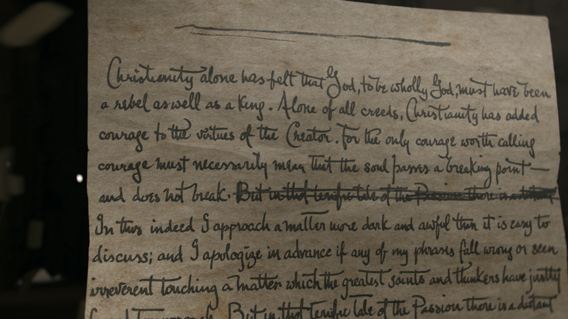
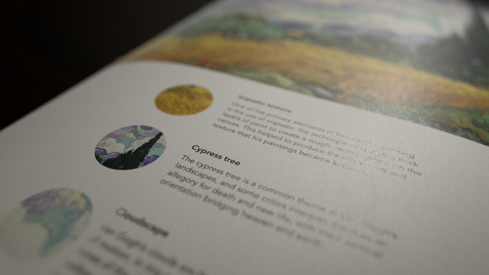
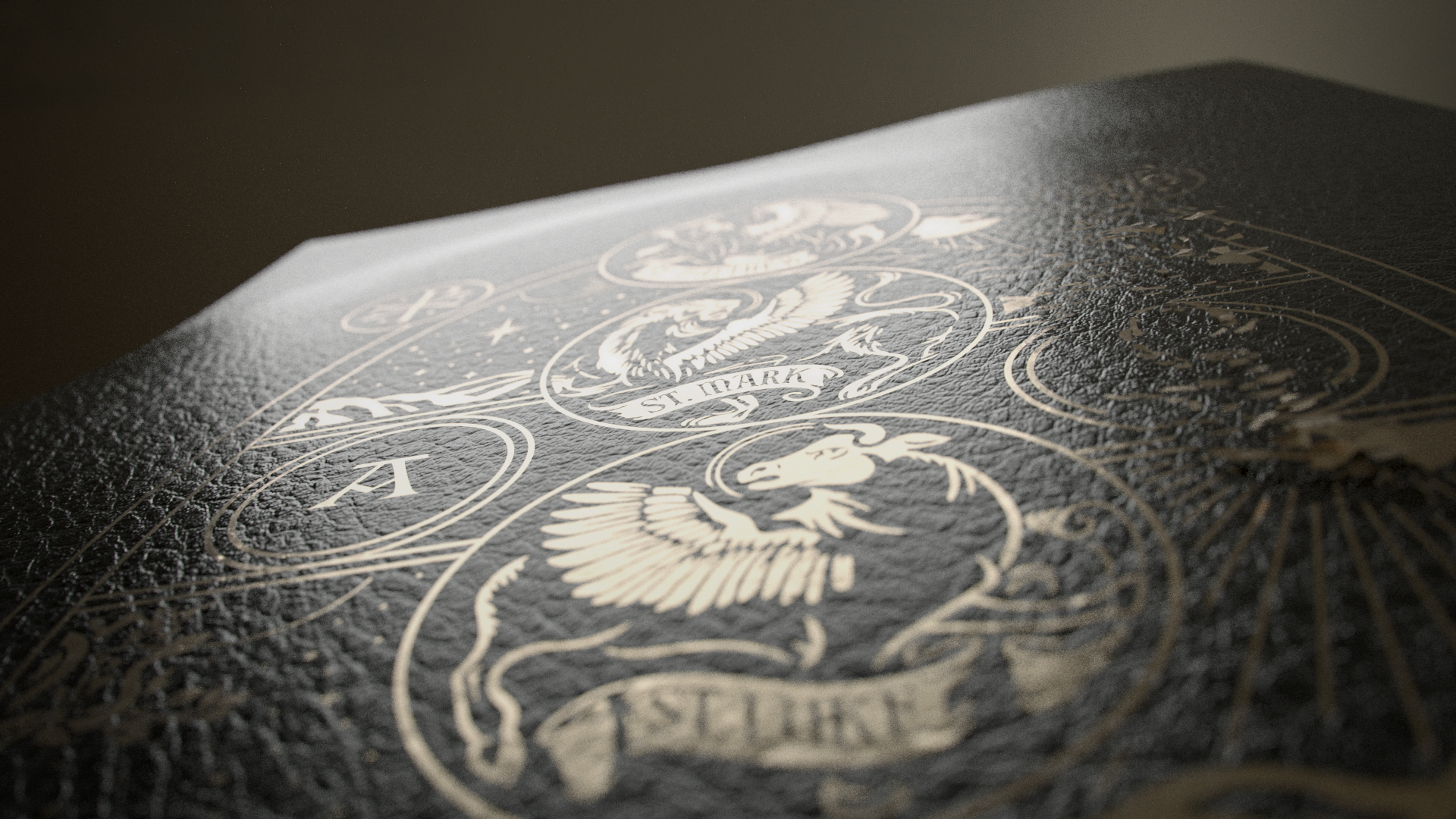
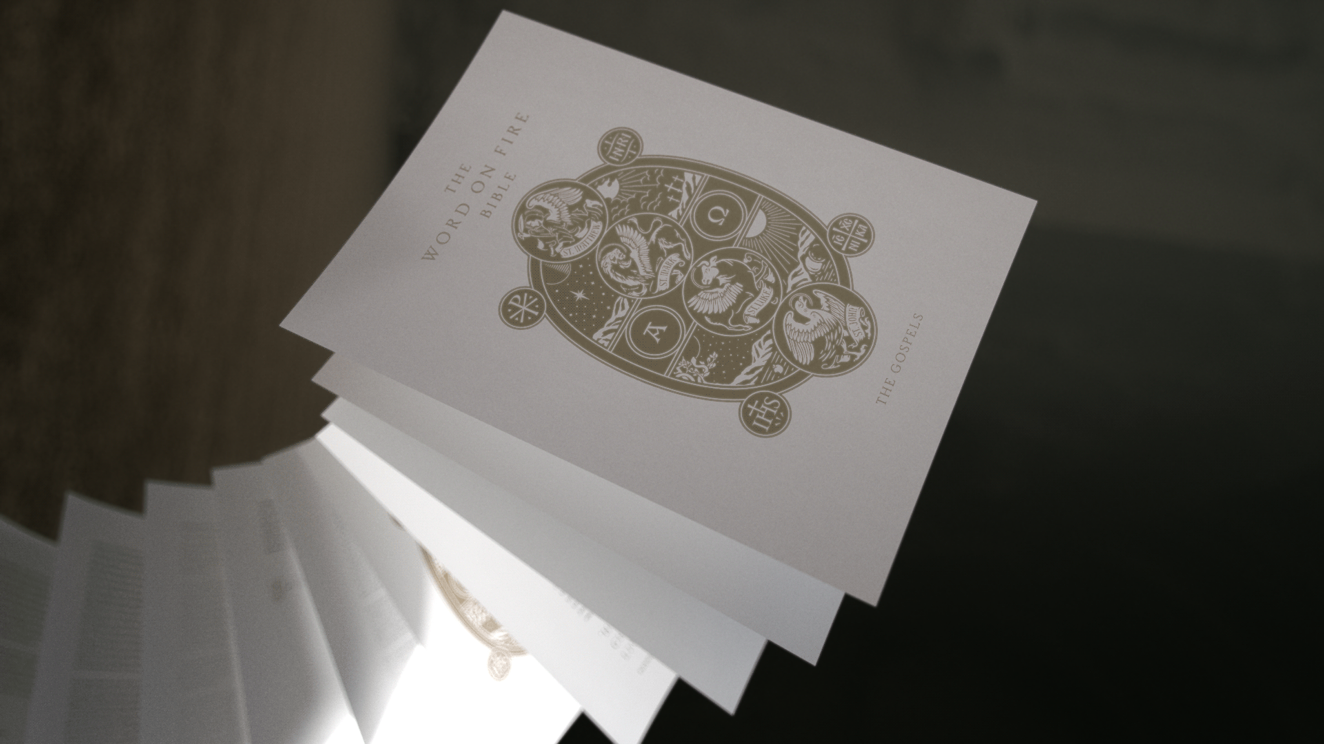
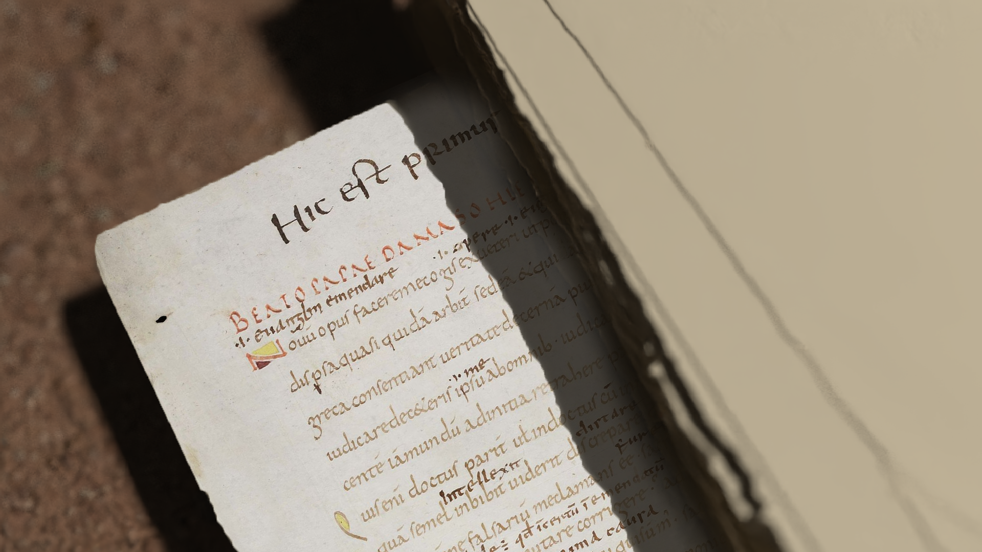
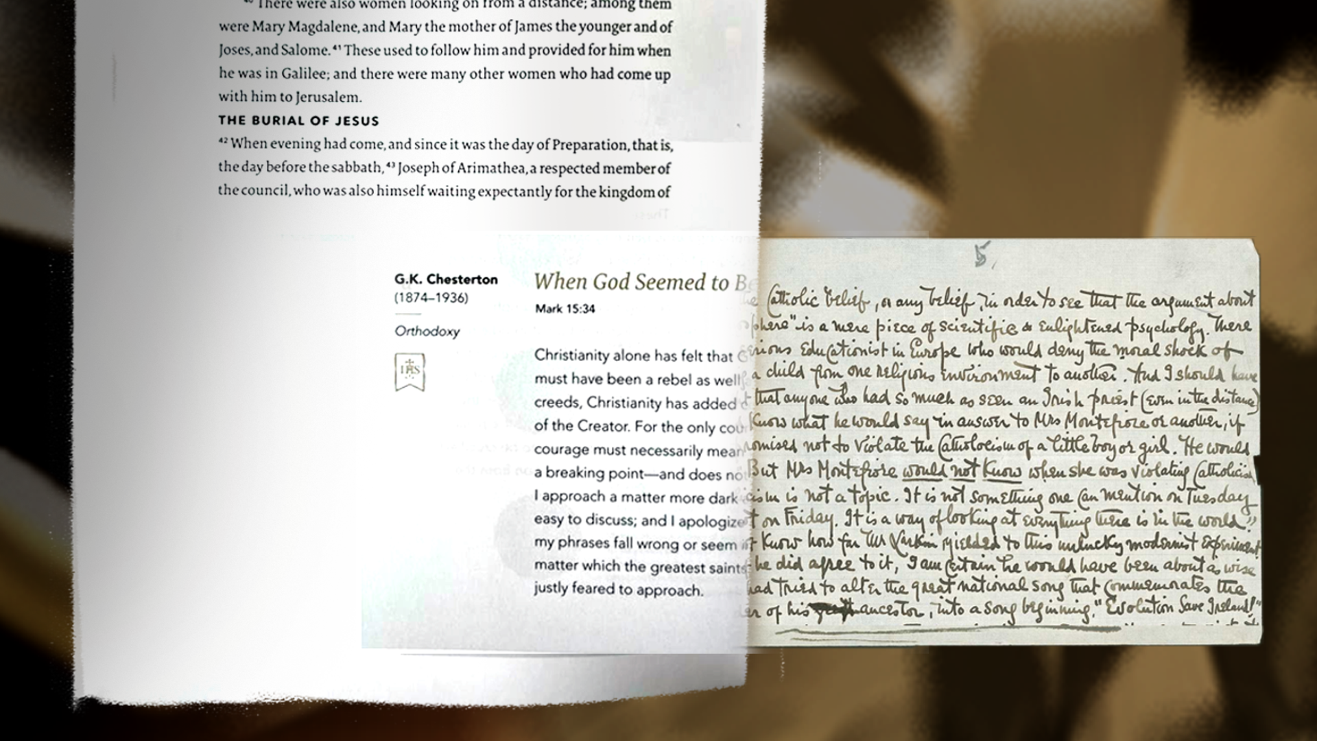
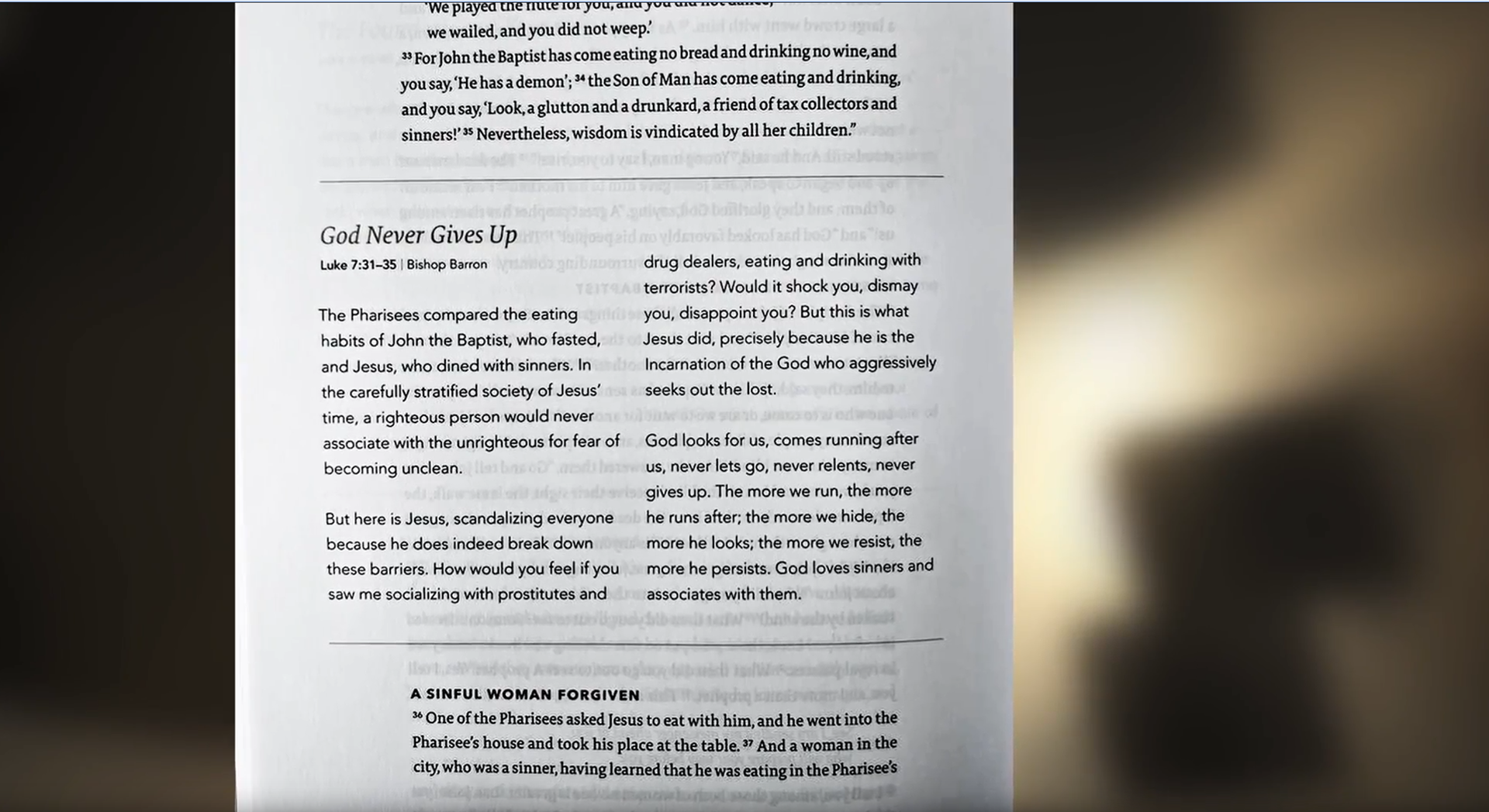
Page Textures of Bible based on Designs by Nicolas Fredrickson and Michael Stevens
Impetus
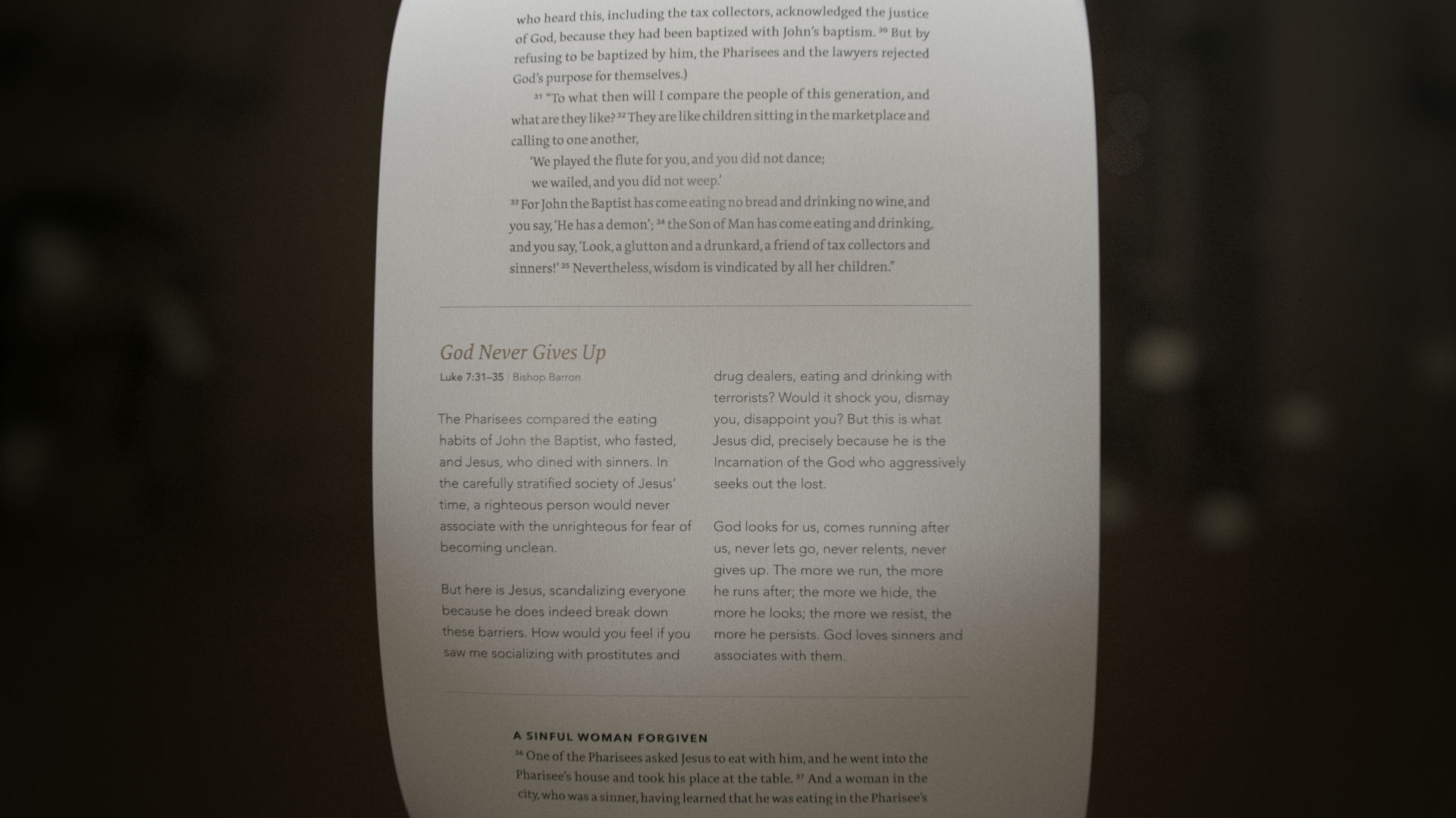
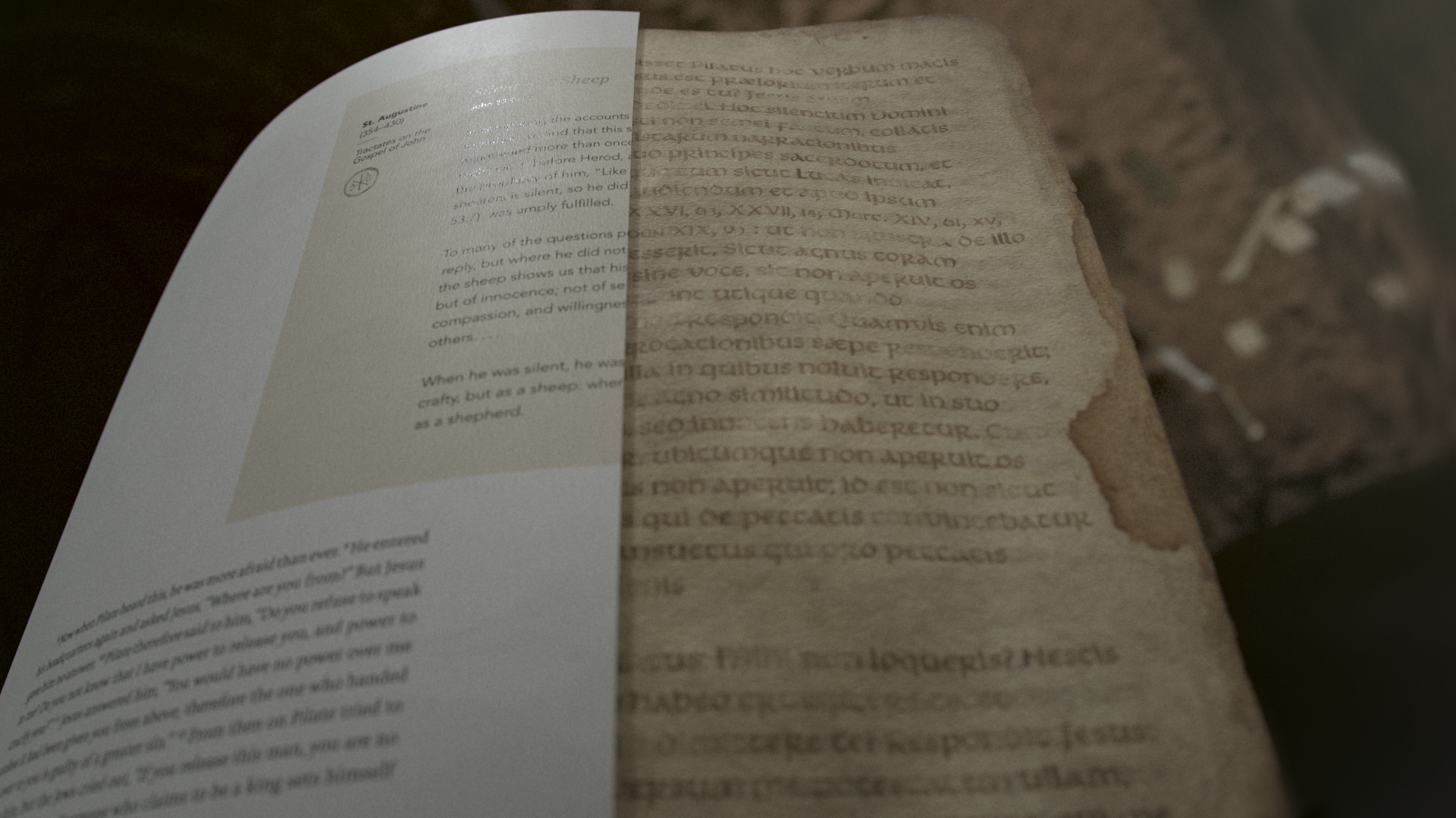
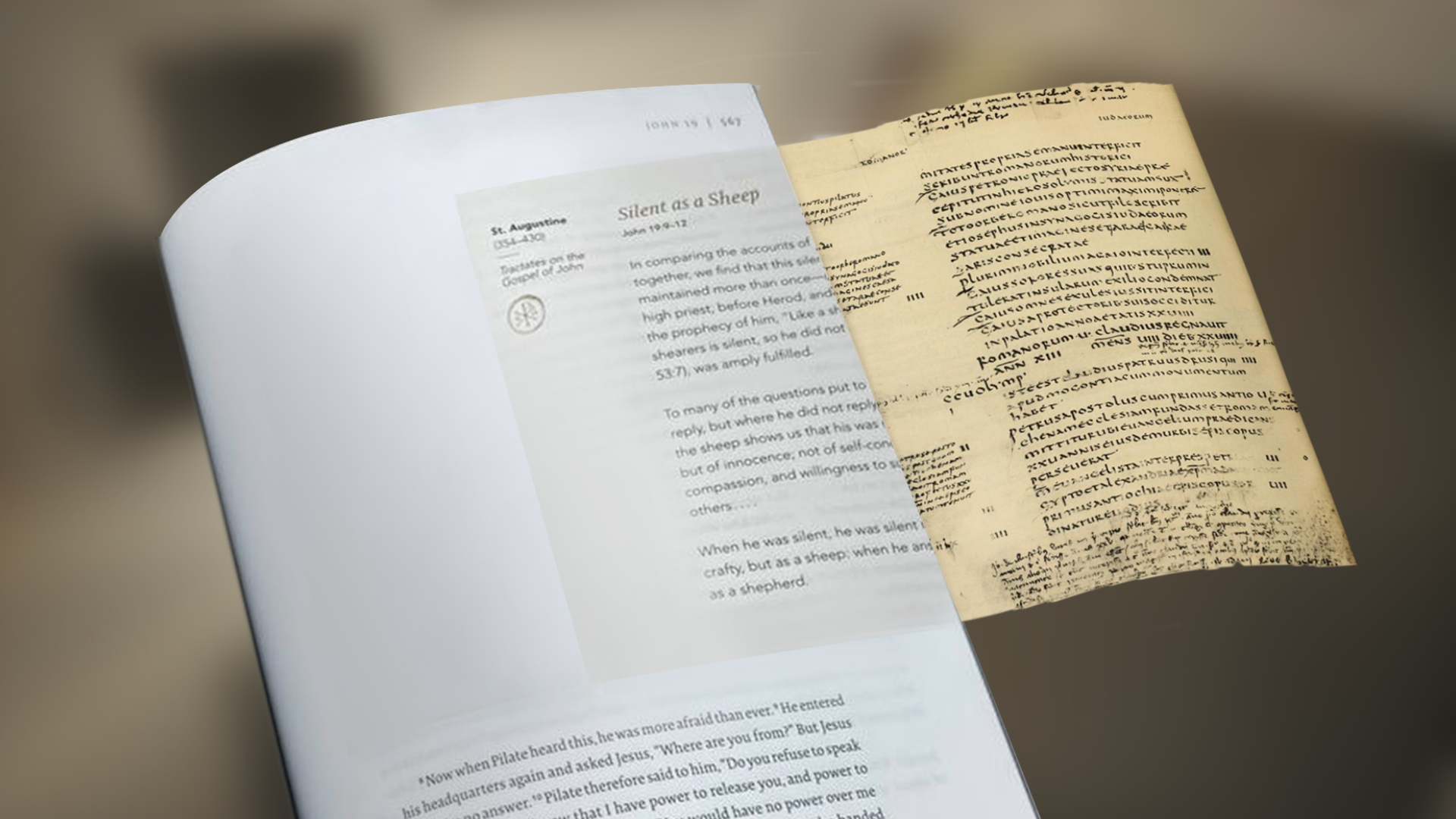
I had first encountered the Word on Fire Bible through newsletters and updates the team had published. But after my father had gifted us siblings with some copies, holding it in my hands was an entirely different experience.
I was so taken by the depth of the biblical adventure that was palpable through the pages. Inspired by the work, I reached out to the team and pitched the idea of making a game-trailer-like animation for the project.
Final Outcome
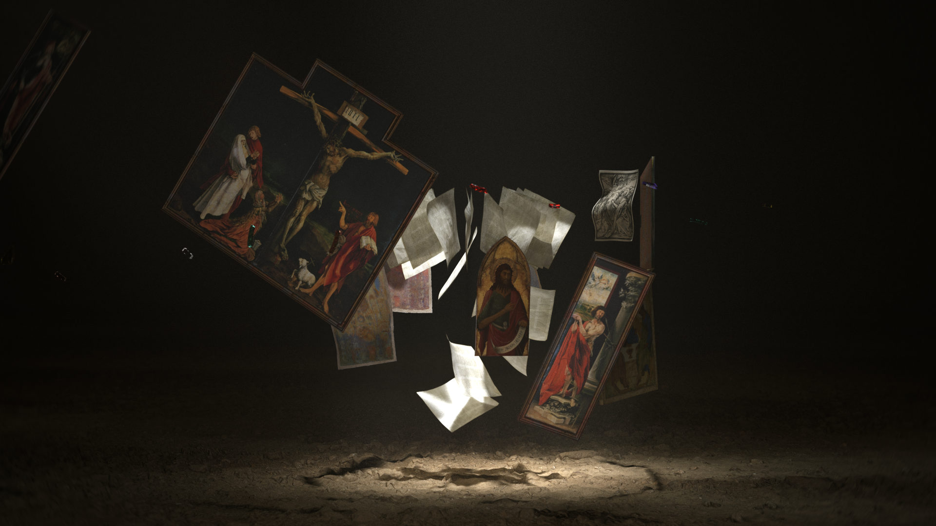
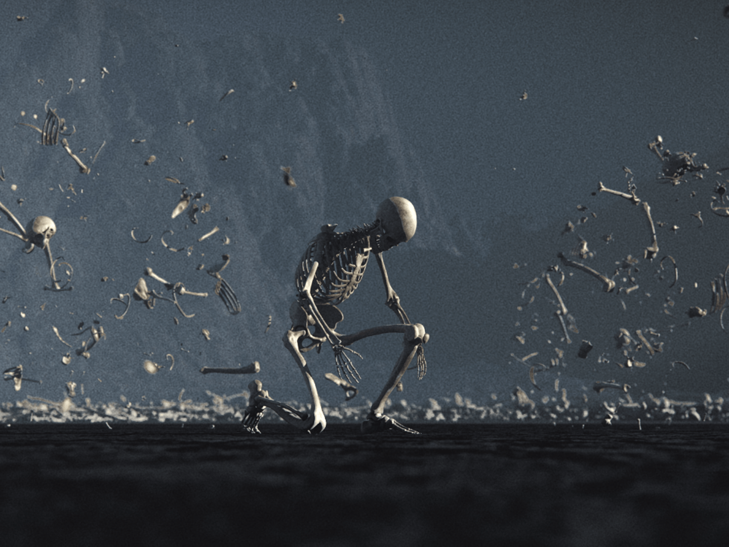
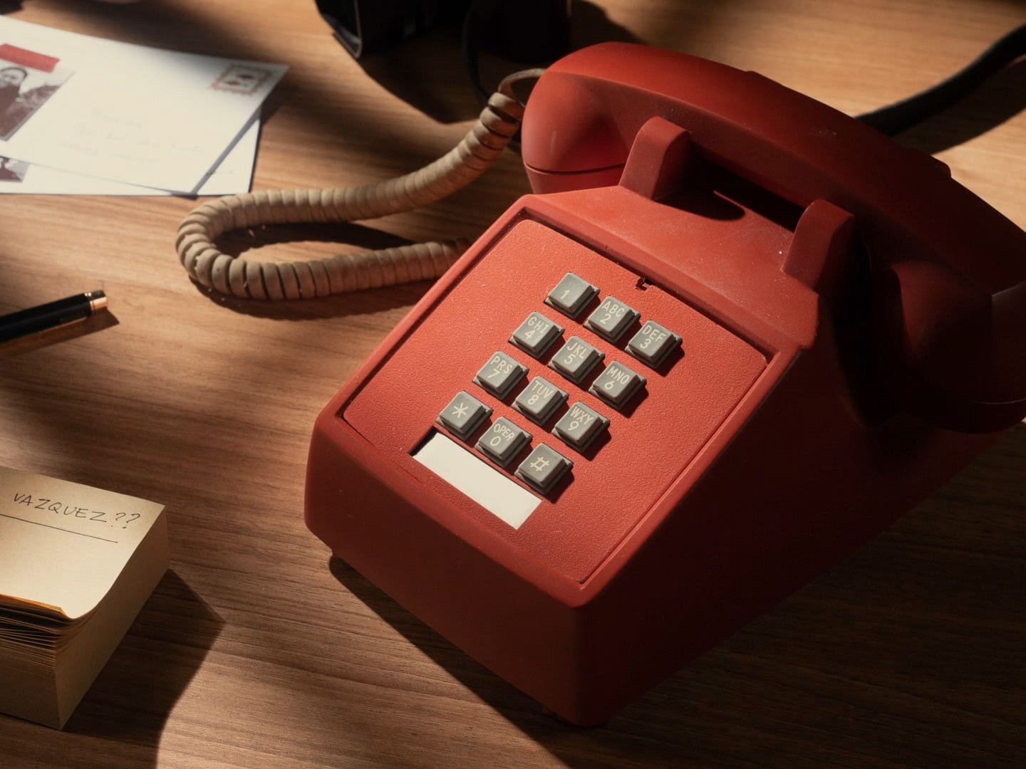
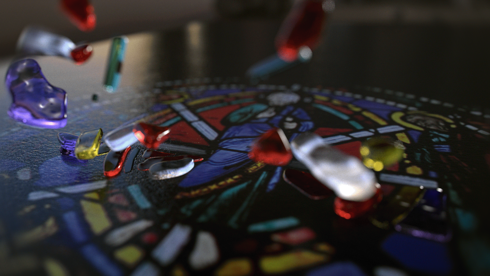
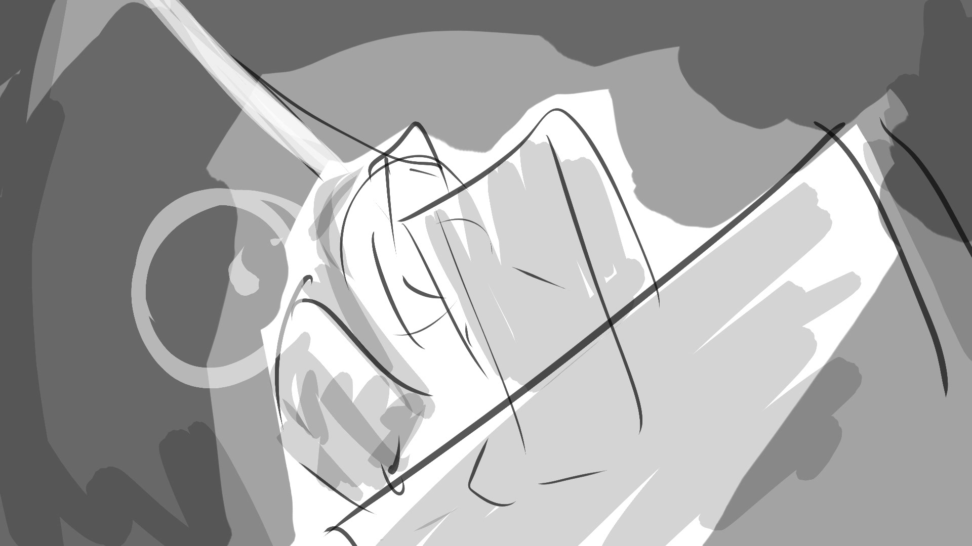
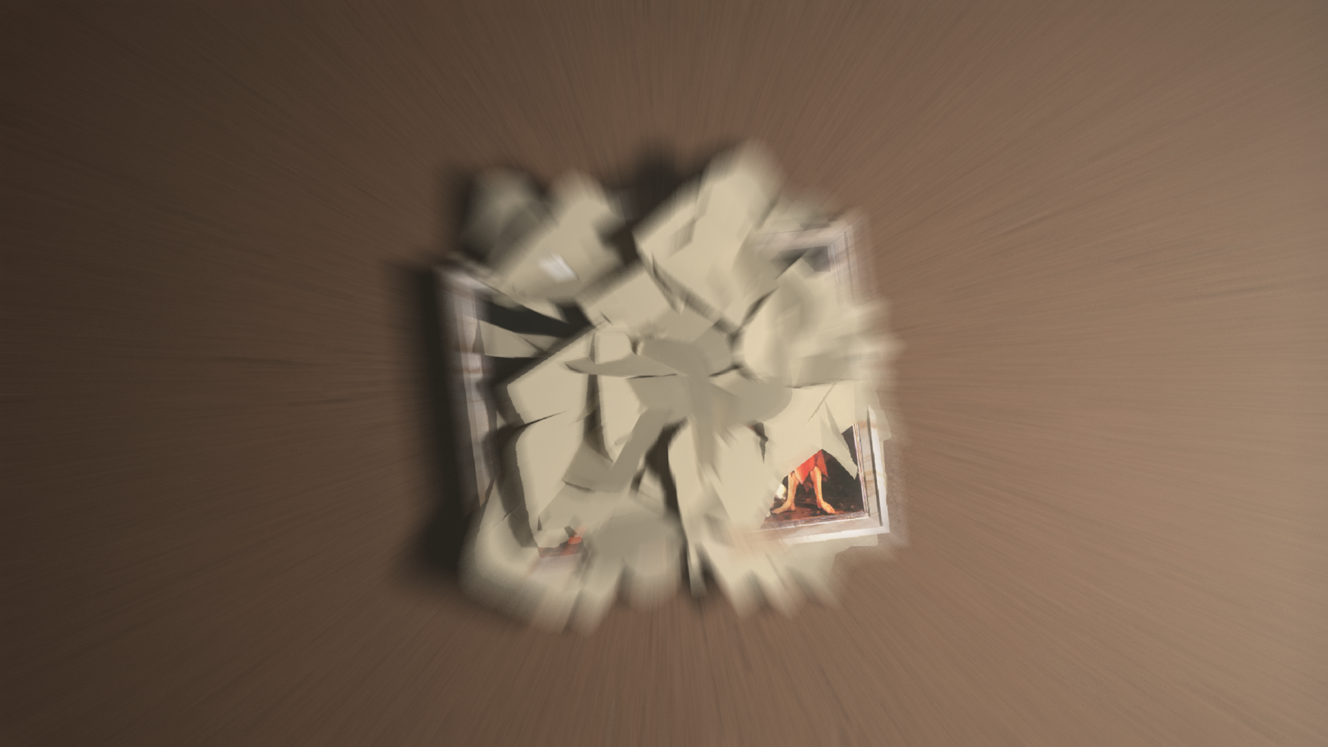
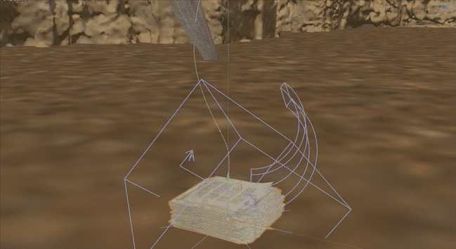
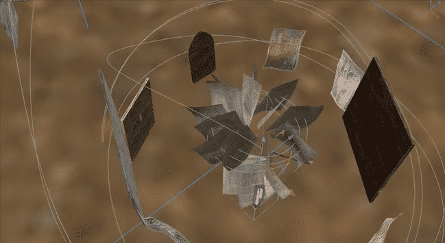
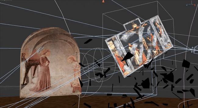
We created an photorealistic short film that visualizes the concept of taking all the rich tradition, art, and writing from classical and contemporary authors, all coming together in the final printed book.
Sourcing textures from libraries, building 3D materials from scratch, and using designs that were already made for the printing, everything was done in CGI and produced remotely.
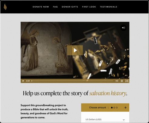
The final film was used in the support-the-project website.

Process
Starting with Music
Whenever I can, I like to start with music. In this case, I started combing through the library in MusicBed.com. Doing this allows me to piggyback off of the event archs that the composer thought through when making their piece: the beginning, the build-up, the crescendo, the conclusion, maybe some tense parts that add interest. I'm also able to cycle through many different moods and see what matches with what I see/saw in my mind when conceptualizing the piece. I finally settled on Lux by Ryan Taubert.
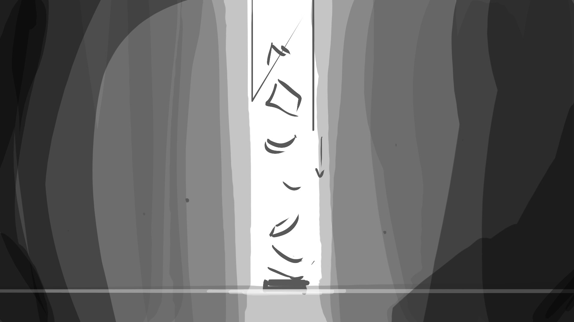
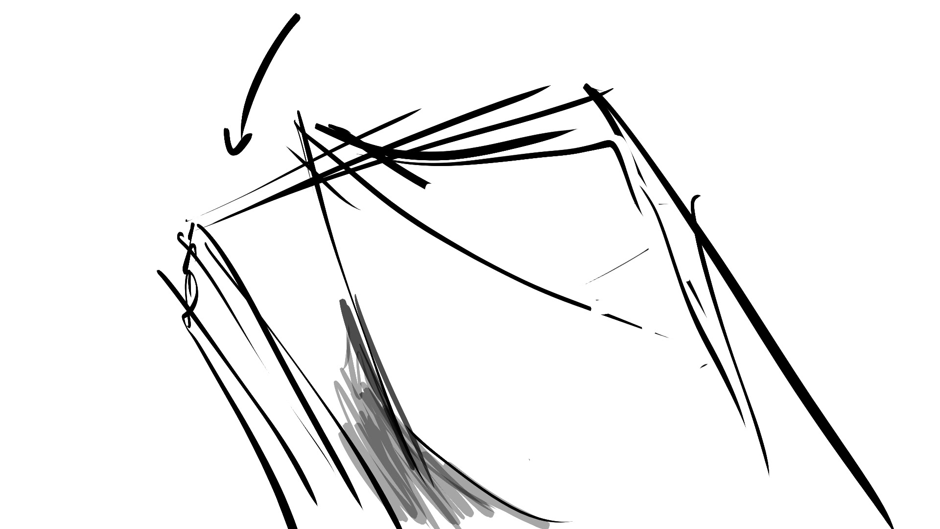
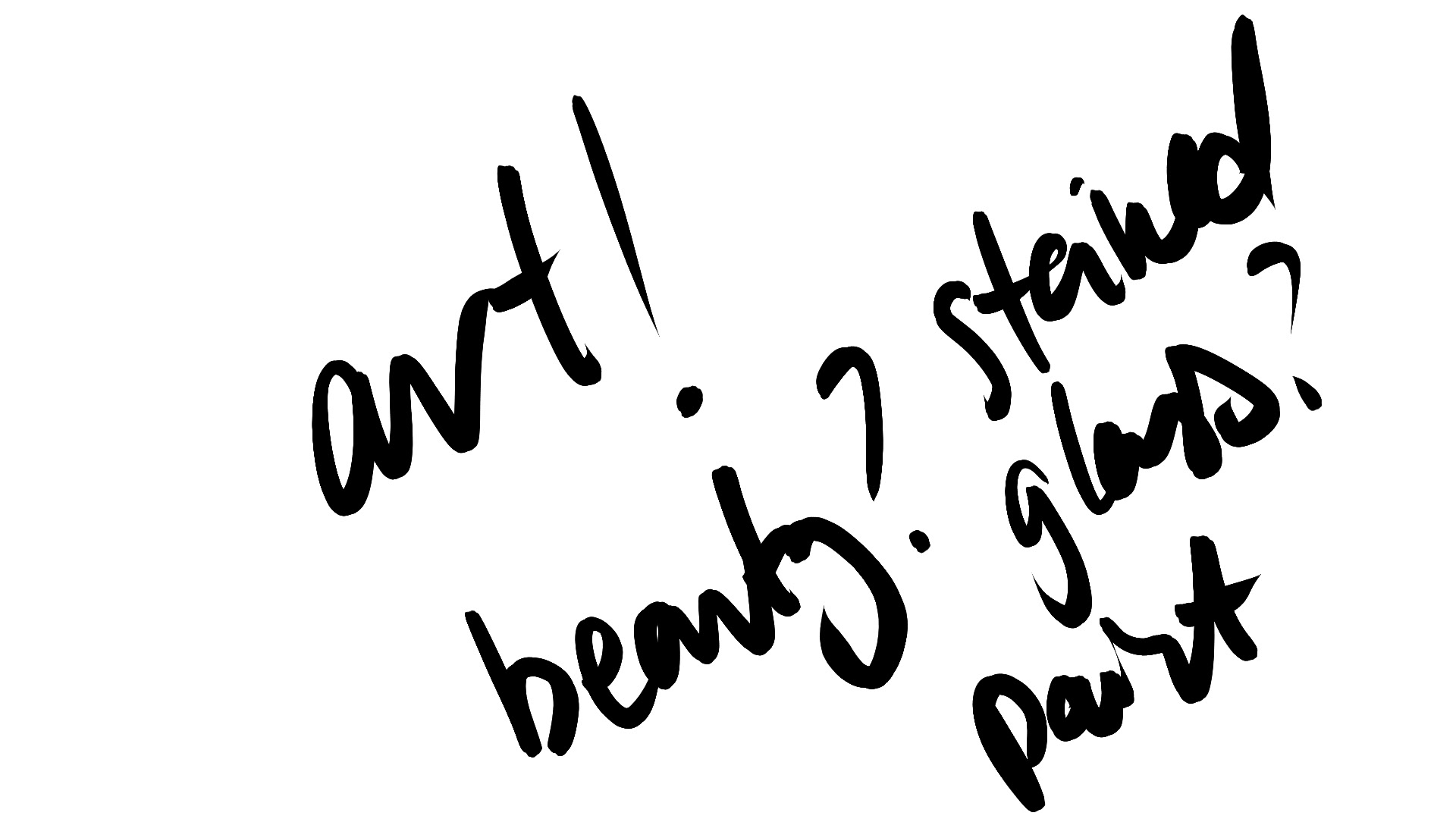
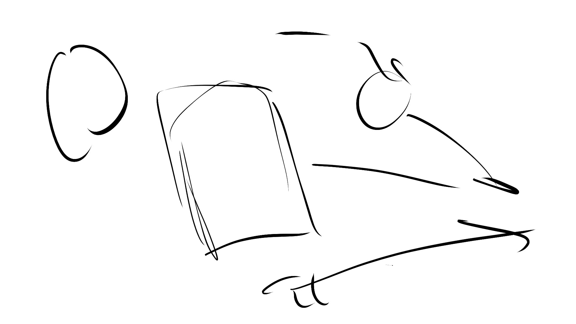
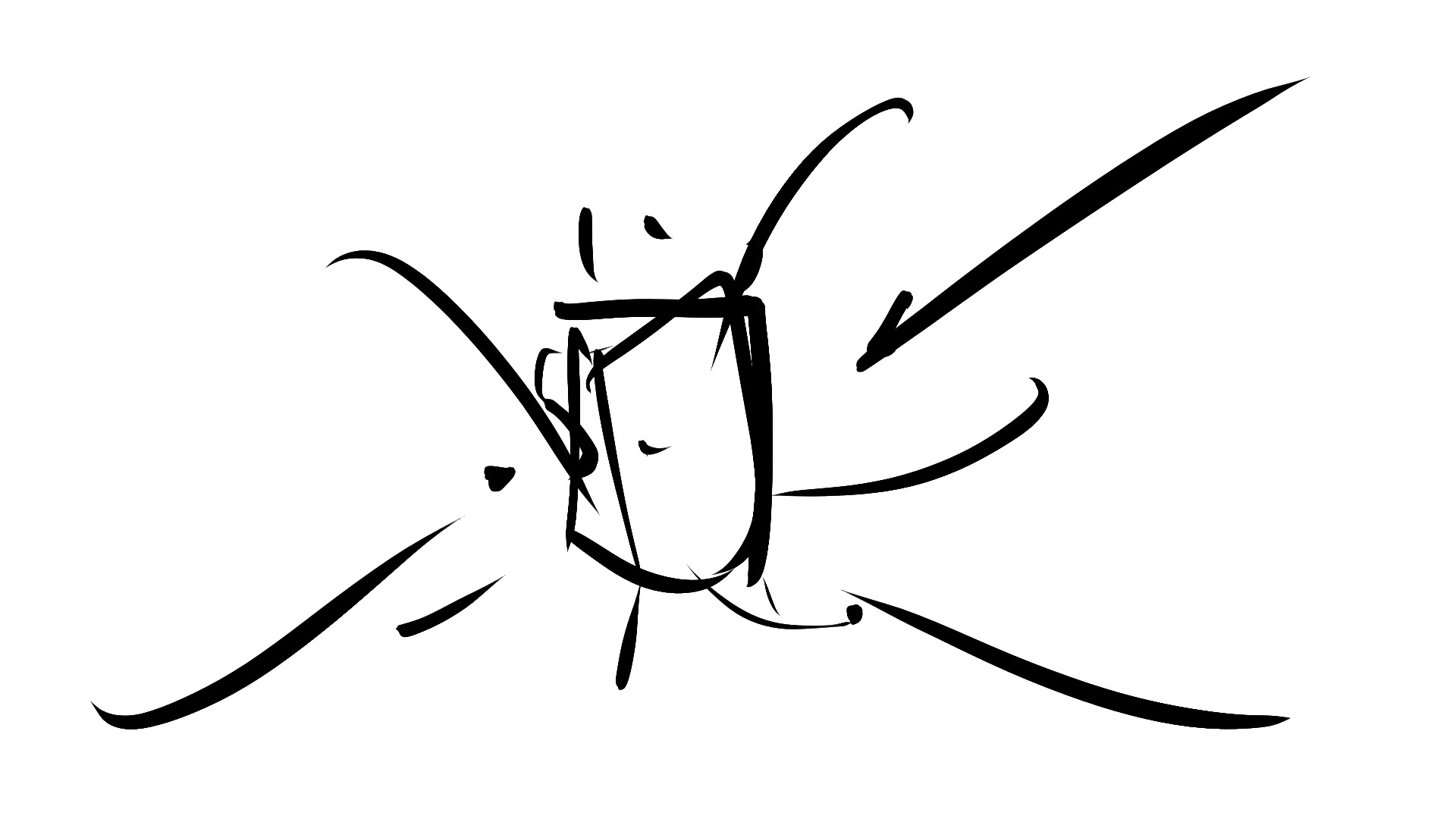
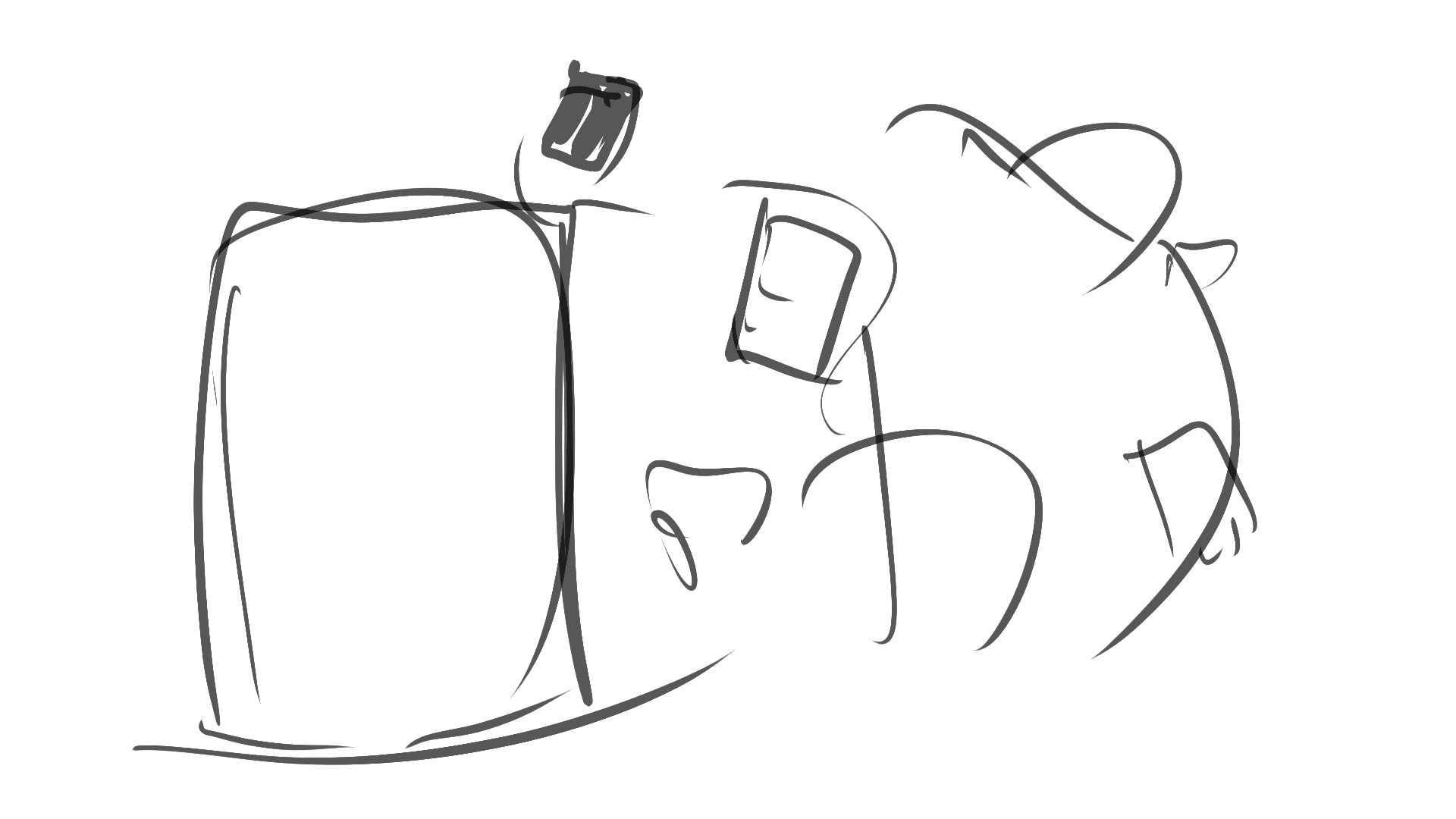
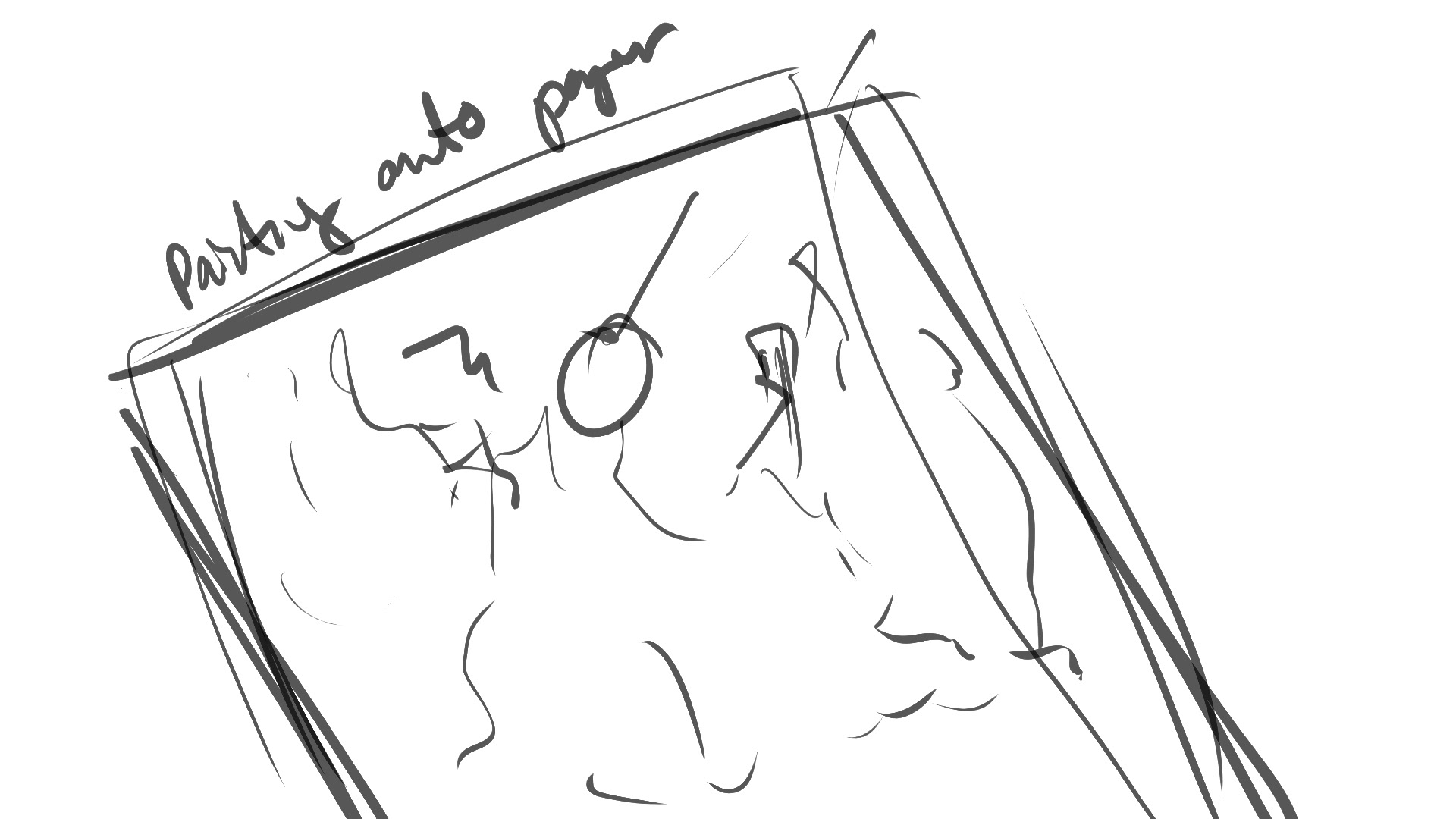
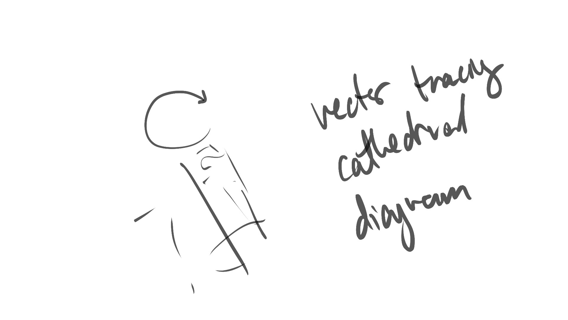
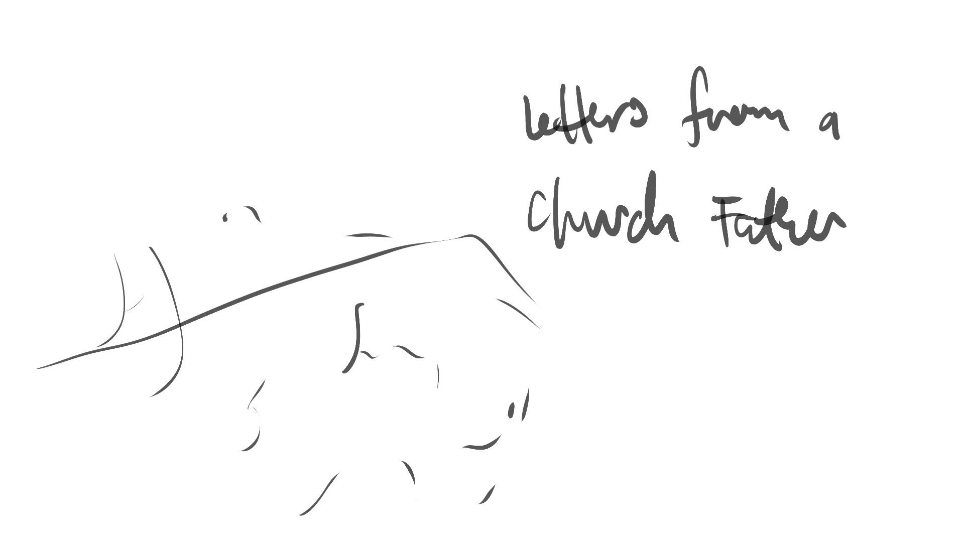
Chicken-scratch Storyboards
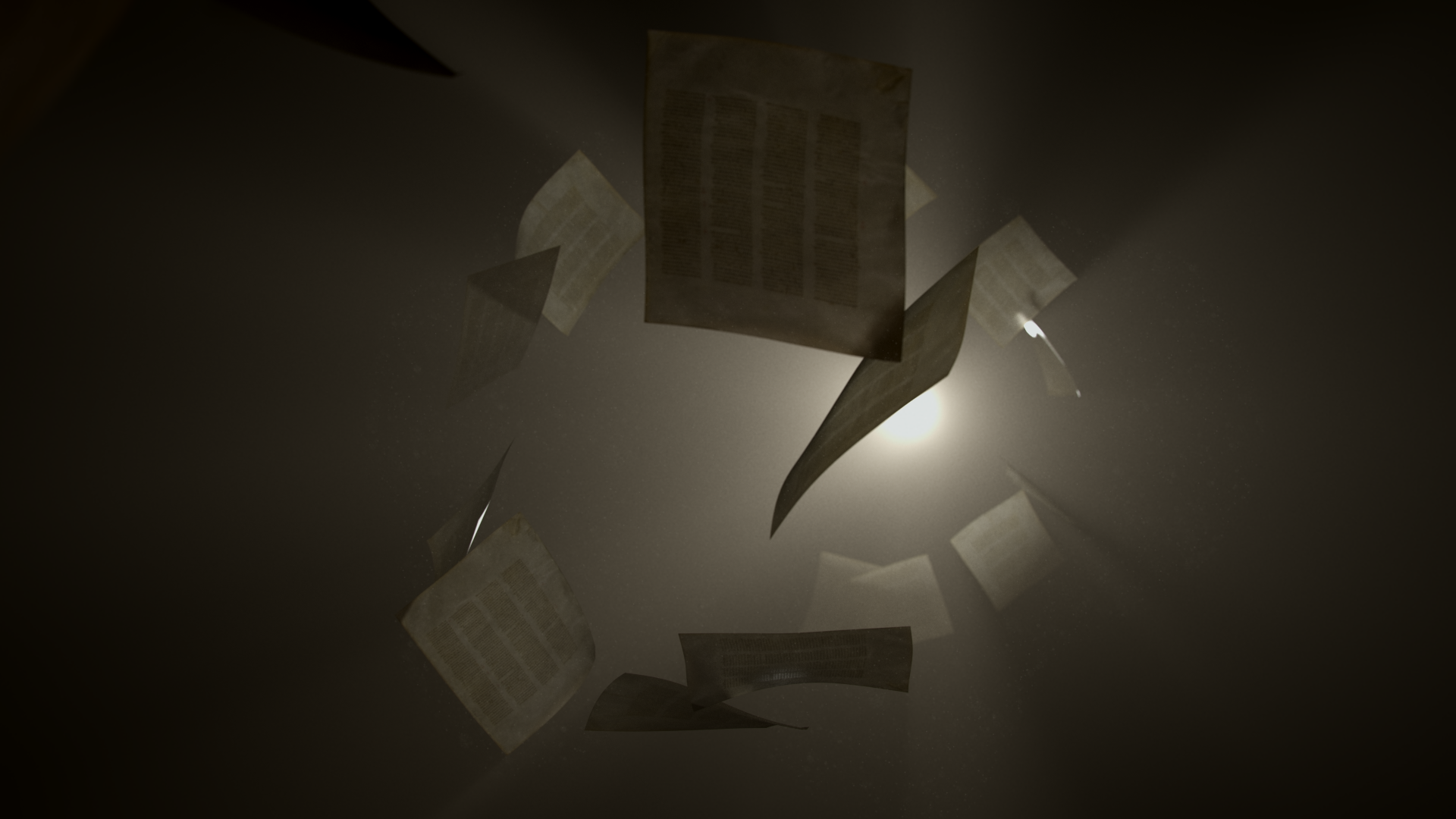
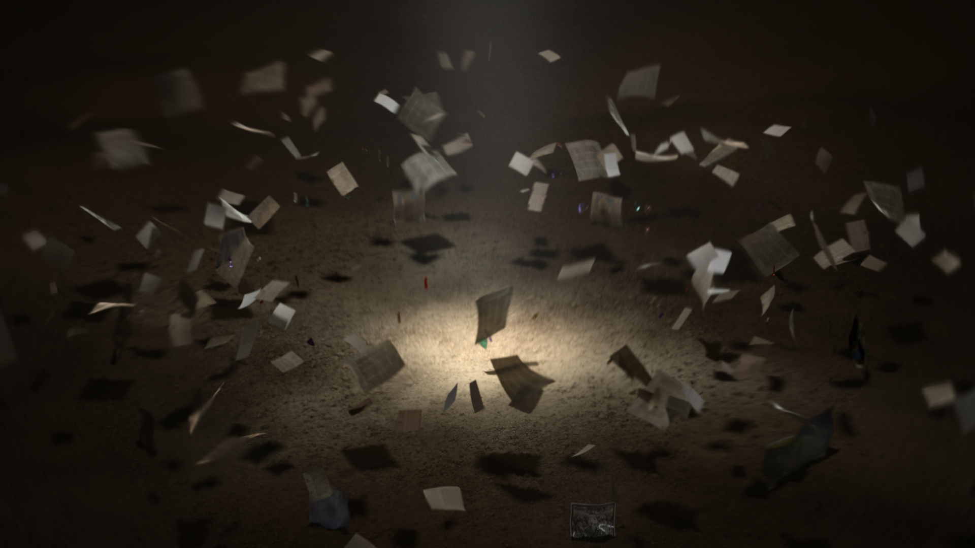
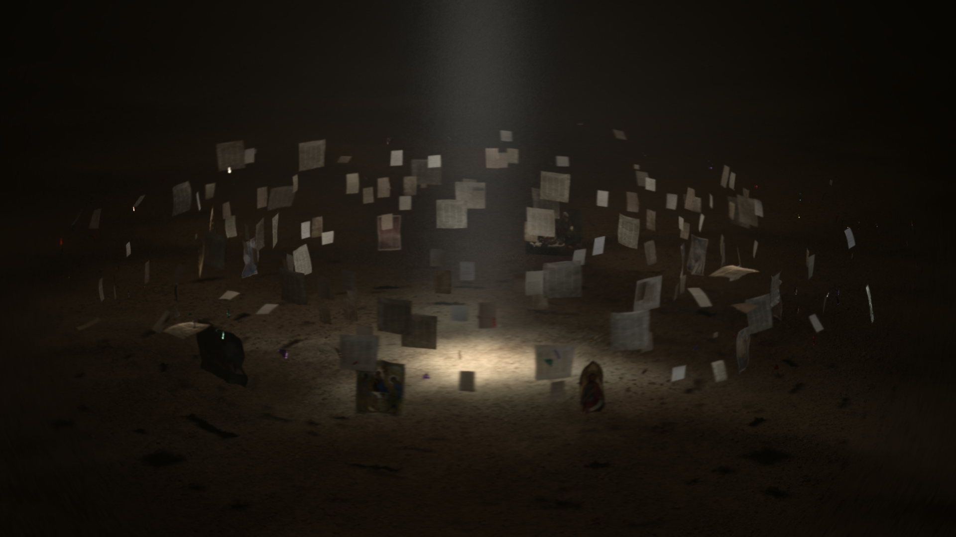
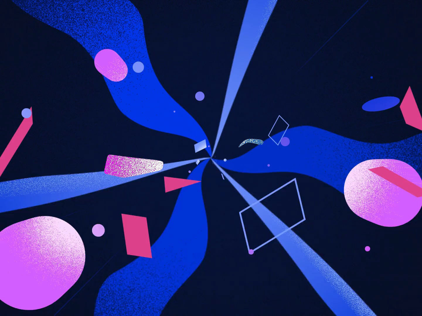
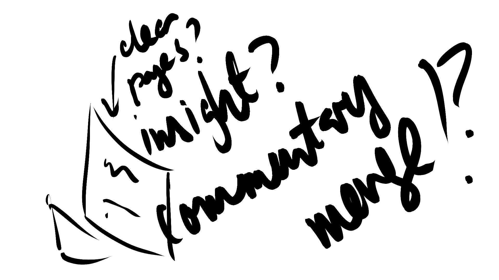
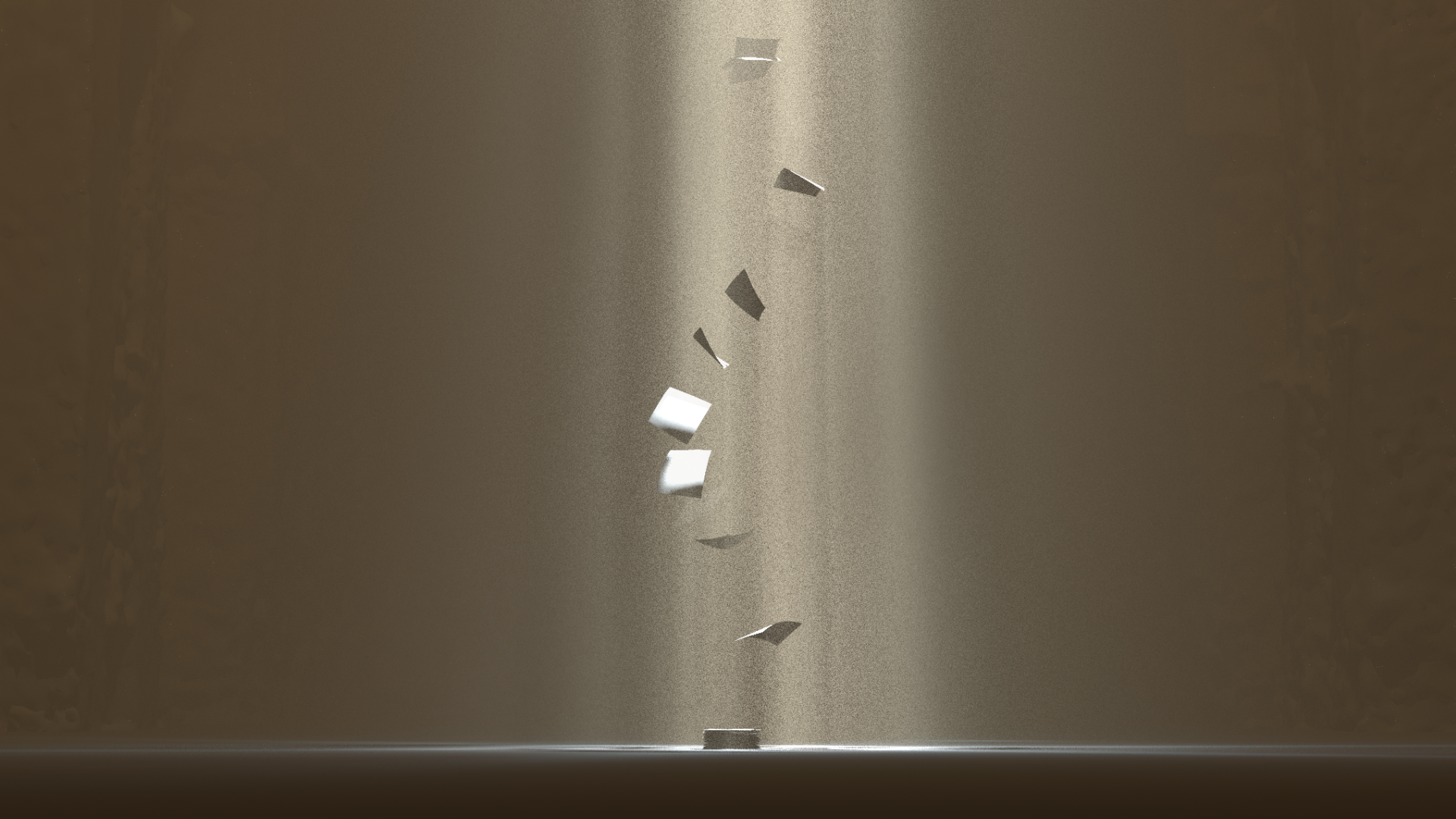
These are often so low resolution or crappy looking, that it's easy to feel like they're unnecessary. But every micro-decision that's made with a sketch brings a particular shot closer to reality. The abstract idea of "papers flying around" becomes "papers taking up about 60% of the screen are flowing in a spiral from the top left to the bottom right of the frame."
Seeing the first sketches also allows me to flesh out how to give an initially attractive idea an equally attractive visual execution, or to decide whether it was an idea worth presenting at all.
Maybe it was an idea that I thought needed its own visual beat/shot but it ends up being more of a mood to be baked-in across the whole piece.

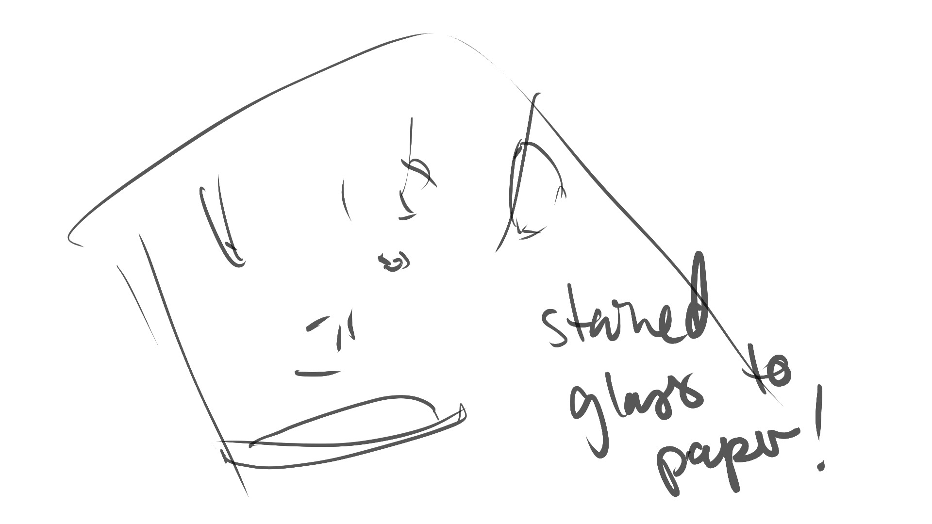
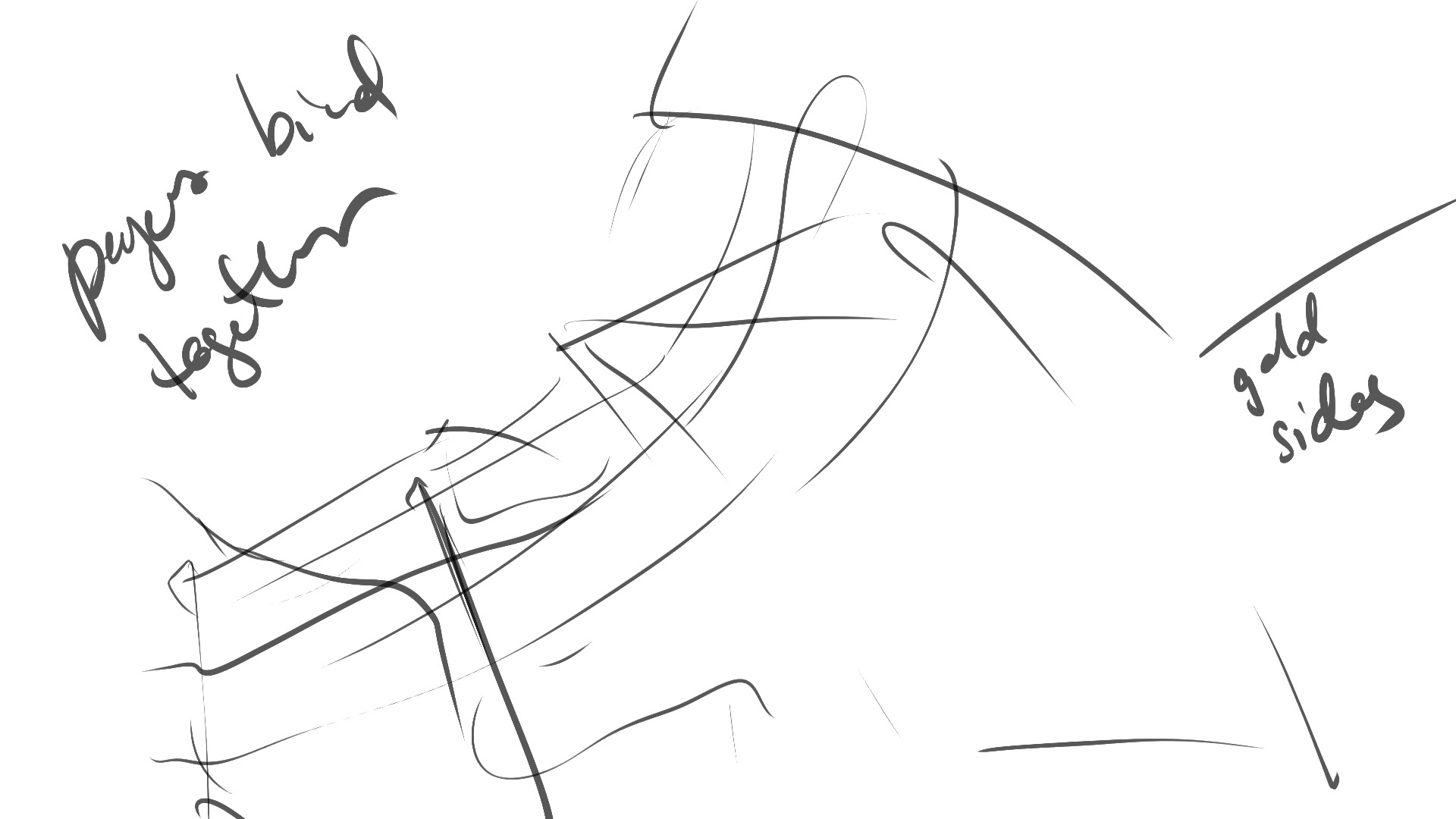

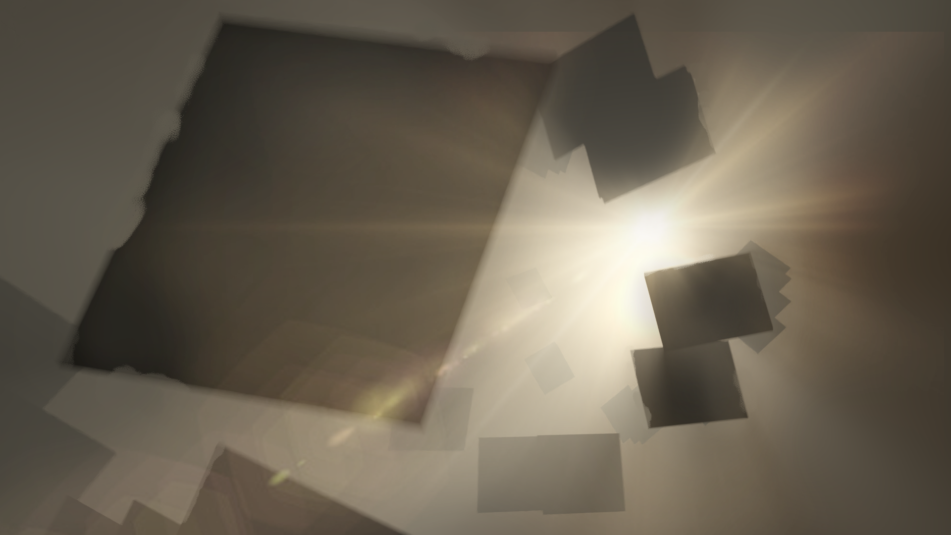
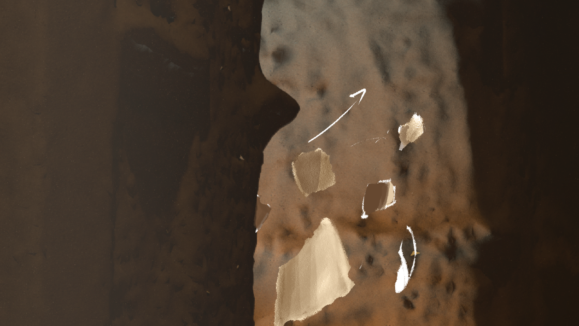
Style Frames
This is when, based on the gathered references, I try and render something that the final output might look like. This could be made with photos I take to find an angle, blocked-out with viewport renders from Cinema 4D, or just developments from the chicken scratch sketches either photobashed or painted to look closer to the mood of the final piece.
These will guide the look of the final piece.


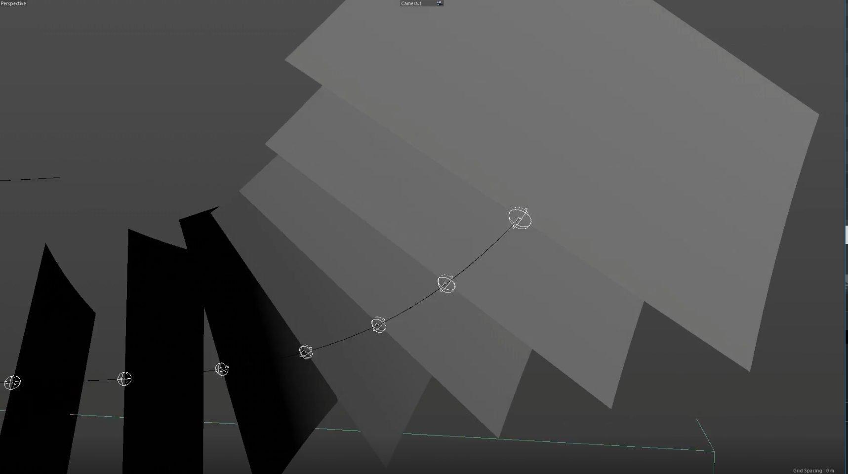
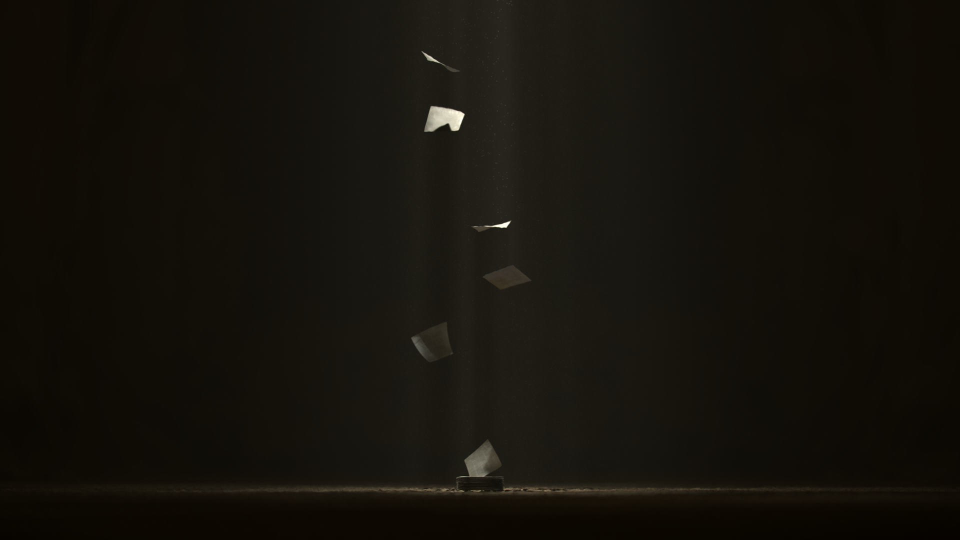
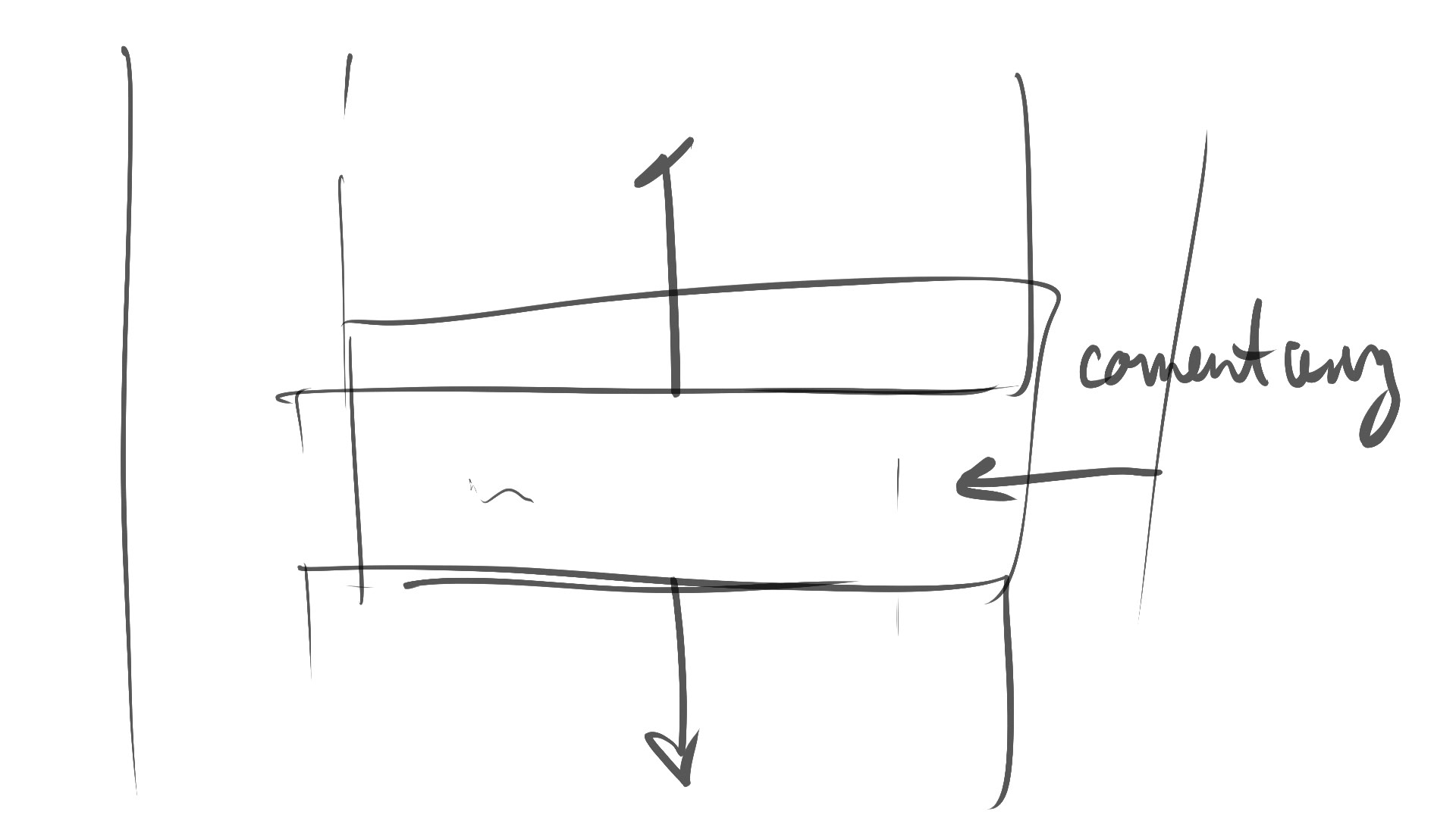
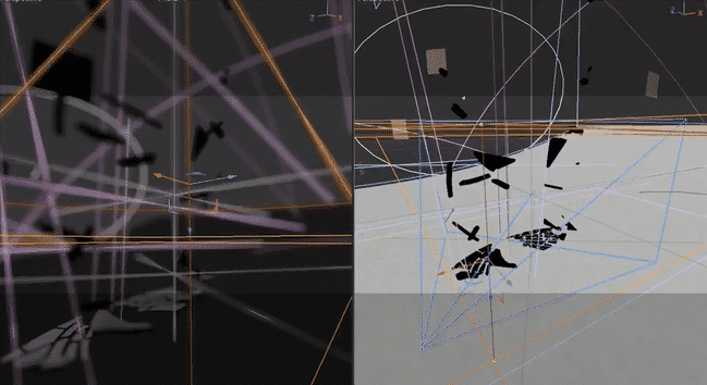
Layout, Test Renders, and Animation
Some of the layout work was partially done because of how useful it was for composing the style frames, but some of these had to be cleaned up or remade from scratch.
The test renders were done mainly to bolster my confidence in a shot by showing myself that the end-product would be promising. I would jump between animating a show and lighting and texturing it to see if it would look good. Towards the later shots, to quicken the process, I finished animation on each scene before moving on to texturing and rendering.
Let’s bring some contemplative craft
to your next project
to your next project
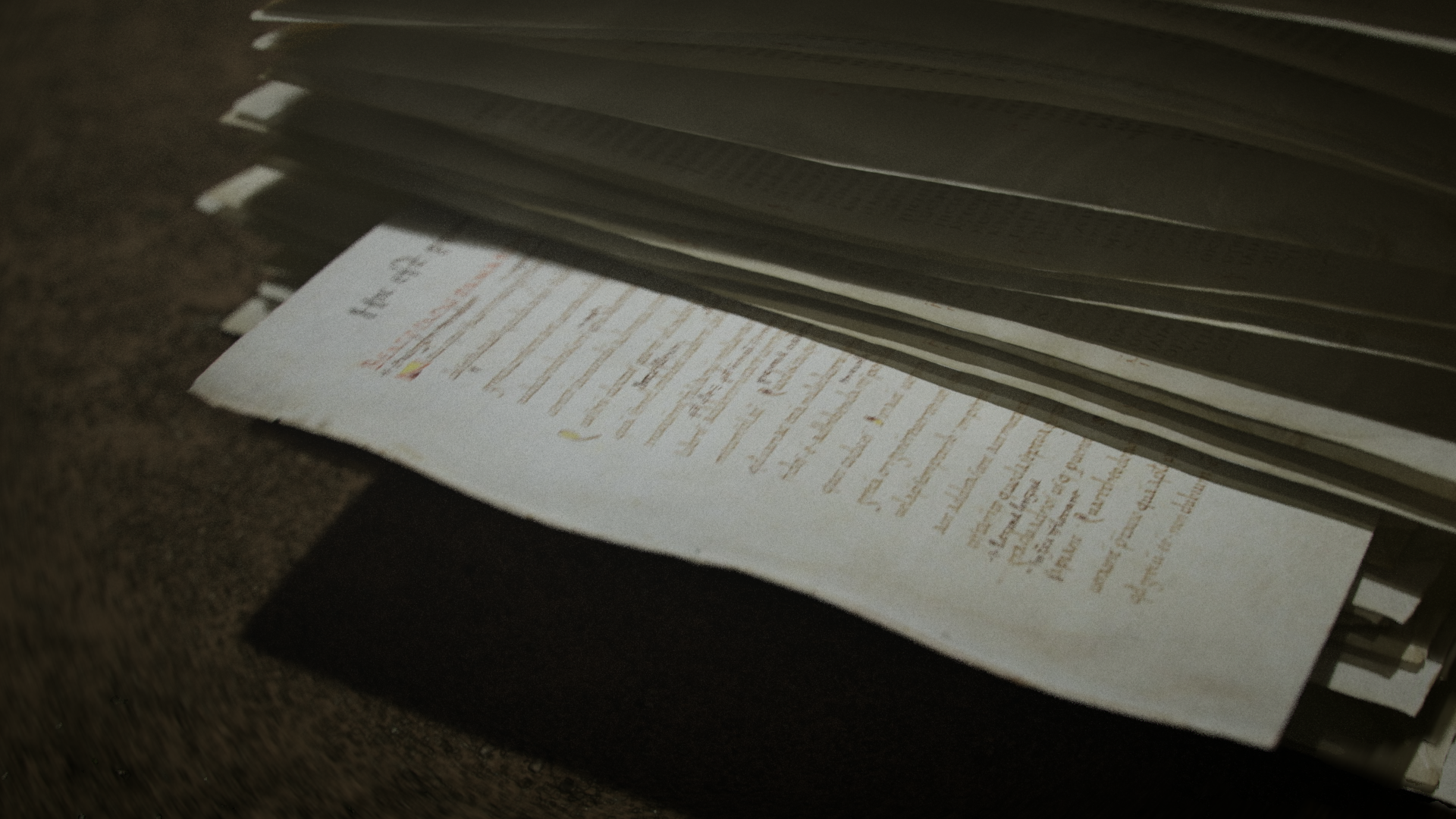
Final Renders and Compositing
The hardest part about rendering is finding the right settings for a good mix of reasonable render time and a quality product. A couple things were further engraved in my mind after this project. The first is that I deeply appreciate Redshift's Unified (automatic) sampling, where it basically sets up all those nitty gritty settings for you. The second is seeing how much you can push a render in compositing and color-grading.
I'm learning more and more about proper render settings, setting up AOVs and specific render passes, but at some points in this project, I also allowed myself to pull up my bootstraps and do what had to be done to just get a good looking image out.
For color-grading, I employed the services of the very talented Toni Gozum-Ticsay to really make the whole piece pop. Toni really brought a depth to the piece that I couldn't have, having only dipped my feet in color-grading.
Process Breakdown Video
Timing and flow is established with the Animatic.
Layout and Rough Animation then prove the concept in 3D.
Using the Style frames as a guide, we're then able to texture, light, and Render the scenes till we get to the final product.
Color grading is the final cherry on top.
Impact
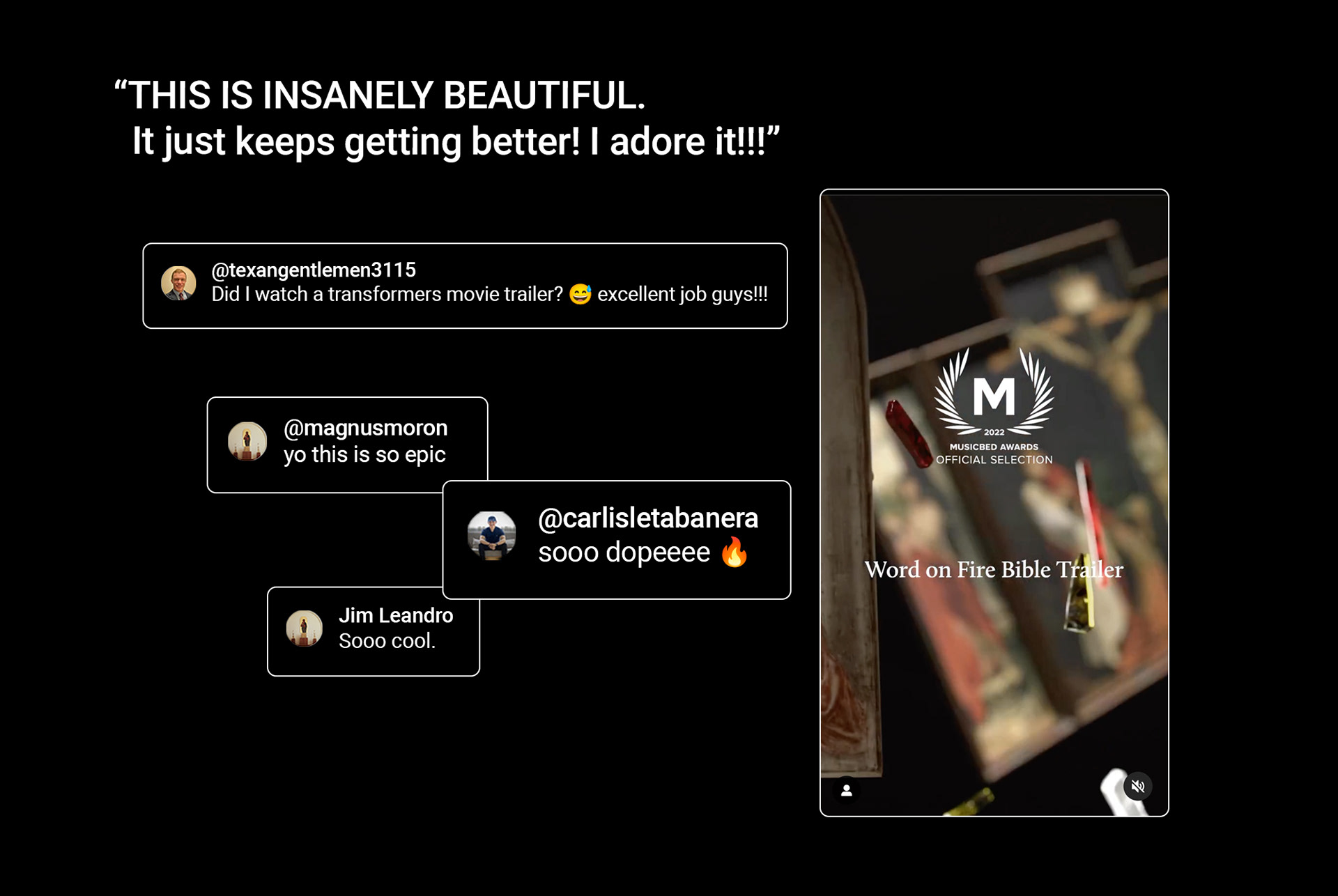
The client was extremely happy with the final result. On release, comments and interactions with the post had people expressing their appreciation for the visuals.
The piece was also chosen to be February's Official Selection for Music Bed Awards.
Thoroughly blessed and grateful to have played a part in this project.